
MX Web Design
MX Web Design Tests the iPhone Due — Now the Whole Team “Needs” One
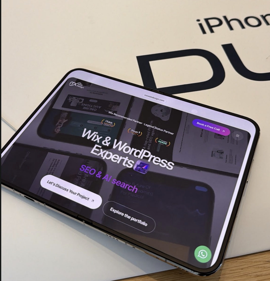
It started as a website responsiveness test. It ended with the team trying to justify new phones as a business expense. Just another day at MX Web Design.
The team don’t want it. They NEED it. 📱
I’ve been in Austin this week visiting clients, with a little Formula 1 and Texas Longhorns action squeezed in along the way. A productive business trip with a few excellent distractions.
Then I stumbled across the Apple Store. You can probably guess how that went.
A quick look around turned into pulling up the MX Web Design website and putting its responsiveness to the test on an iPhone. Strictly work, of course.
The verdict? We love it. Seriously cool, and suddenly the team’s wish list has become a little more expensive.
From client meetings to a little Apple research
We’re suckers for Apple, so leaving without getting distracted was always going to be ambitious.
But beyond the excitement, it was a useful opportunity to experience our website exactly as a potential client might: picking up a phone, opening a browser and having a look.
When you spend your days designing websites, that instinct follows you everywhere. You notice how the images resize, whether the text is comfortable to read and how easily you can move between pages.
Even in Austin, with racing cars and American football competing for your attention, a little website testing finds its way into the schedule.
Your website should feel effortless on every screen
A website needs to look great wherever someone opens it. That could be on a desktop at work, a tablet on the sofa or a phone while they’re out looking for a local business.
Each visitor should be able to understand what you offer and take the next step without fighting the layout.
That’s why responsive design matters. It allows your website to adapt to different screen sizes while keeping the experience clear, consistent and easy to use.
At MX Web Design, we pay attention to the details that make that happen:
- Readable text: Clear typography that doesn’t require visitors to zoom in.
- Flexible layouts: Images and content that resize naturally across devices.
- Simple navigation: Menus and buttons that are comfortable to use on a touchscreen.
- Quick-loading pages: Thoughtful design and optimised assets to help keep things moving.
- Clear next steps: Straightforward routes to enquiries, bookings and purchases.
Your visitors might never notice the work behind those details. They’ll simply notice that your website feels good to use.
Stunning design with a purpose
We love creating websites that look impressive. We also want those websites to work hard for the businesses behind them.
Whether you want more enquiries, product sales or appointment bookings, your website should guide visitors towards that goal. Strong visuals, clear messaging and an intuitive layout all play a part.
Our team brings together website design, branding, SEO, AI search and Google Ads to help businesses strengthen their online presence, from how they’re discovered to what happens when someone lands on their website.
And yes, we’ll happily use an Apple Store visit as another excuse to think about the mobile experience.
The team’s verdict: essential equipment
There may be a few quirks to iron out, but our enthusiasm for Apple remains firmly intact.
I’m calling it research. The team are calling it a necessity.
Either way, our Austin detour was a reminder of why we enjoy what we do: exploring technology, getting excited about good design and bringing that attention to detail into the websites we create.
Ready to put your website to the test?
If your website could look better, load faster or feel smoother on mobile, let’s talk.
From website design and branding to SEO, AI search and Google Ads, MX Web Design can help you take the next step.
Book a free 30-minute call and let’s get started.
And be honest — do you need one too? 👀